This week’s post takes a look at some trends we’re seeing on the stationary front for weddings 2021-22 that we love and think would be an amazing detail to include for your destination wedding in Ireland. Need help figuring out what works for you? Reach out to us and schedule an appointment to speak with our design team and talented team of planners!
Botanical | Organic
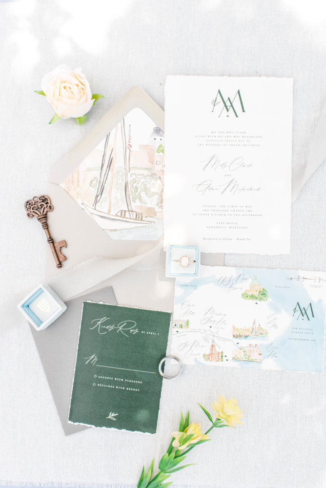
Botanical details are still so “in” for 2021-22 for stationary, but with a twist. Gone are the geometric details (think 3D cube or octagon sketch with botanical details. Keep the pop of nature and color going, but pair it instead with a sleeker, more sophisticated presentation using simple clean fonts, simple layouts and letting the clean lines of the wording balance against the color and movement from the botanical accents. This suite from is a perfect example illustrating an on trend version of the botanical style suite.
Green tones in particular for this style will be huge for 2021 into 2022 and can carry throughout every season. With small tweeks in color tone, you can move effortlessly from fall through winter, spring, and summer. Need help figuring that out? Definitely reach out to us — color balance and expression is one of our design specialties!
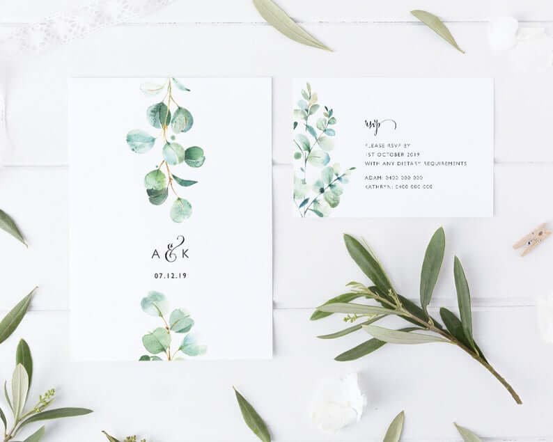
 I love the bright and soothing green tones in this suite in particular — this can go with virtually any wedding style and venue. Eucalyptus is a classic green and popular choice for clients for their wedding day flowers — a wonderful way to add a pop of something floral into your day, especially as a menu at the table setting if you can’t afford a sprig of fresh real greenery. The script is clean and eas y to read, modern but with a touch of romantic flare — this is just wonderful to anchor your day’s wedding stationary style on if you’re keen on a botanical look.
If you prefer a more minimalist style, a sketch botanical detail is the way to go. This design by is the perfect balance of minimal design with a botanical accent to keep on your botanical theme.
Modern Clean Lines & Fonts
This is probably my personal favorite style I want to see clients incorporate into their day. Often destination wedding clients feel they have to go with something super ornate especially if it’s a castle wedding. That’s certainly not the case or the expectation. If your style is a bit more clean-lined and minimalist, there is some spectacular fonts out there that can perfectly achieve a minimalist style you love but feels “fancy” enough for a castle.
I really am obsessed with this design style by . I love the font selections, the spacing, the emphasis on good quality cardstock paper. This style is really wonderful for a more casual and relaxed vibe. I love the flexibility for a design like this — we can continue that more casual vibe or use it as a contra-point in a more opulent setting with wonderful effect.
Vellum Paper
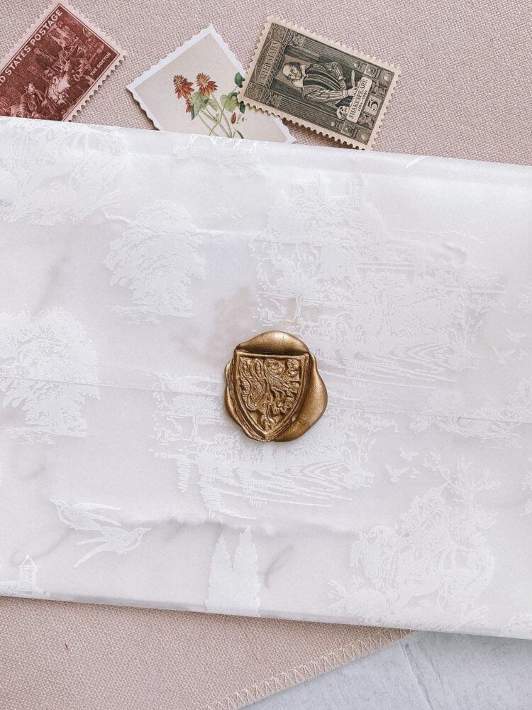
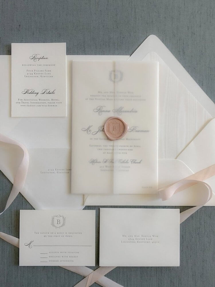
 Vellum has made a comeback on the wedding scene, but again in 2021-22 with a twist. Plain vellum is lovely and classic, but take it up a notch with some added details. This vellum design by Shasta Belle Calligraphy boasts a very sophisticated “peek and you’ll miss it” sketch detail incorporated onto the paper. This creates immense richness and dimension to the stationary as a whole and instantly elevates the design into high-end elegant and formal. Absolutely stunning detail. The addition of the wax seal only accentuates the point.
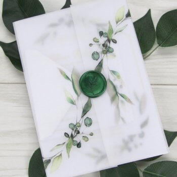
I am obsessed with this style by using vellum. Here we see how you can combine a couple of wedding trends — vellum paper and botanical design — into a really spectacular presentation. The combination is entrancing and romantic. The dark green wax seal is a perfect touch — stunning and unexpected. The vellum’s texture creates this really wonderful ethereal softness that instantly calms and entrances at the same time. This is lovely to help communicate that vibe for your day.
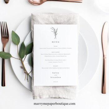
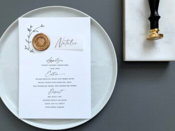 You can incorporate this design concept in your day of stationary as well. I am loving this menu design by in particular. The little touch of vellum tag with the gold seal is a stunning addition to your table setting details. This is a great example of how the vellum can be used as an accent as well, not a main piece of the stationary design. If you incorporate vellum more heavily in your invitation suite, adding a little touch like this on the day is a wonderful way to tie the whole presentation together. The trick is to think about what trend stand out for you, and how can we incorporate that trend in the right balance to suit your wedding day’s unique vibe.
Metallic Foil Accents
 This is a really new trend we are just starting to see immerge for the wedding season. Metallic accent is nothing new, but we’ve seen it a bit more in the form of brush stroke, wax seal, letterpress, watercolor style accent. We’re seeing a bit more of an emphasis of gold foil as a statement accent to work in on the finer design details for your wedding. These two suites by Shasta Belle Calligraphy illustrate the concept perfectly. The above photo we see gold foil as more of a letterpress style — really classic, extremely elegant, very sophisticated and elevated design concept. It works beautifully with the softer classic wedding pastel tones and that hint of botanical detail with the iris is just lovely.
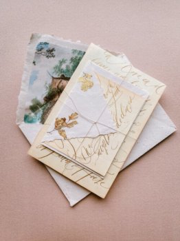
But this style is taking the trend a bit more forward. We see a decided gold foil detail in that foliage that is absolutely stunning. Not much is needed, but it really instantly draws the eye and give me modern baroque vibes. I personally would love to see this in some fall and winter weddings — we can bring in this detail to absolutely stunning effect on the tables and playing off of the table setting styles and centerpieces. If you’re interested in a fall or winter wedding in Ireland, do reach out! I’d love to work on a custom design concept with you using some of these trends!
Vintage-Inspired
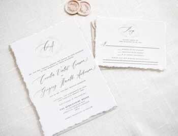
“Vintage” is always a tricky word. It’s like “pink” — can mean a lot of things to different people. What I am seeing and how I interpret the trend is we’re seeing a look back to a classic, traditional, no-fuss stationary suite. This is something that doesn’t have a particular color or detail that stands out — it’s elegant, uses classic wedding colors and tones, the presentation is formal style, and something that will be “in” decade after decade. Color-wise we’re looking at classic white, cream, off-white, ivory for the paper and the font color is black, grey, or blue. The font style is important for this look — you want a balance of a classic block script with a highly stylized cursive style. Something like this suite by is a great start that is traditional but doesn’t feel old-fashioned. The font, wording, overall presentation is very traditional, the vellum is simple, but the addition of that monogram sketch detail feels more contemporary for this style.
If you wanted something traditional but with a slightly more contemporary feel, I really like this by . The style of font has a tremendous amount of movement and elegance about it. The initials at the top is sleek and effortless. This is a lovely option for a slam-dunk class style that won’t feel like your mom’s 1970’s invitations.
Natural | Handmade Paper
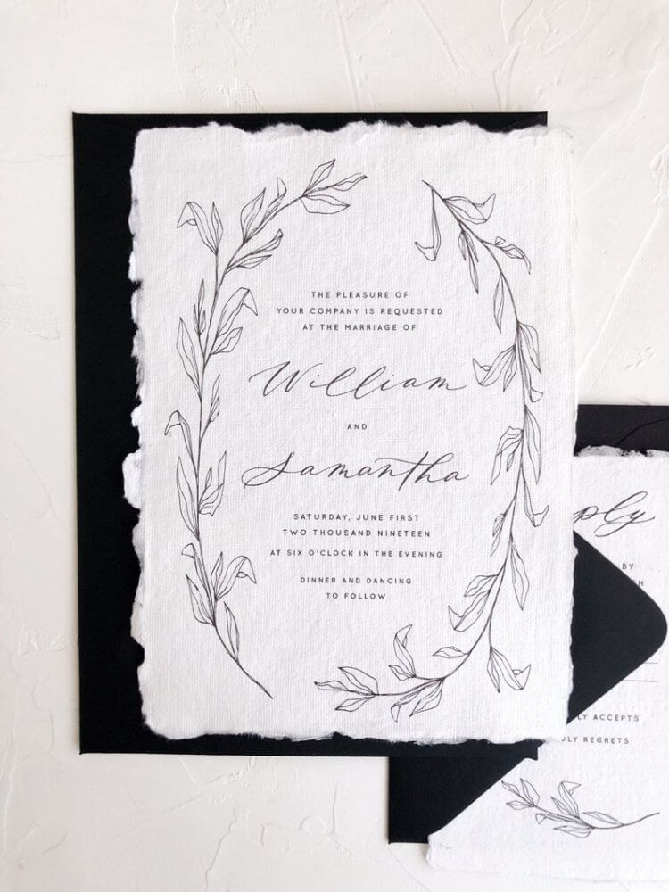
We are seeing a trend in reimagining how handcrafted details can be incorporated into a wedding. One really stunning and unique way is incorporating handmade paper into your day. Creating an invitation suite with handmade paper and a sleek, elegant design like from is an effortless statement of casual sophistication and environmental consciousness. From a design standpoint, texturally it can add incredible dimension to your wedding day details, in particular if you do a menu or place cards at the table setting in similar tone. The key to this design style is quality — natural tones like natural cotton white, greige, taupes, neutral sand and grey tones work best for this effect. Take a sleek design with a simple motif and bring in a pop of your wedding color there — a dark navy, soft dusty rose, soothing grey, sophisticated soft black, or even metallic copper or brass would all be stunning. The motif can range from botanical or natural like an effortlessly sketched sprig or or flower sketch to a classic monogram or light venue sketch. The trick here is to go clean, simple lines.
Colors
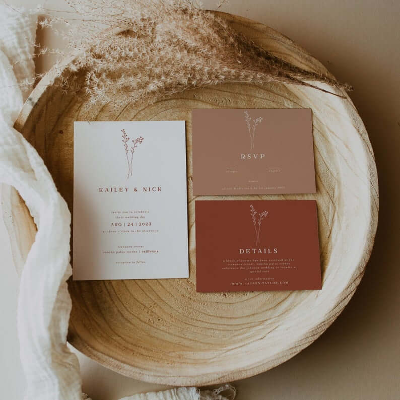
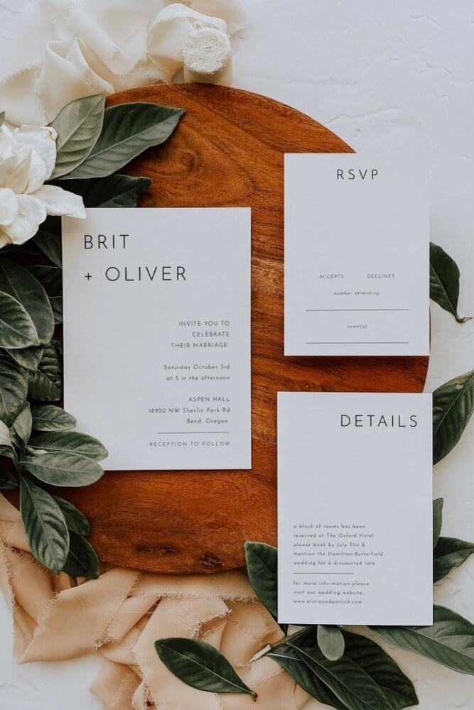
Earth Tones will be hugely popular for 2021 going into 2021. These soothing tones — especially brick, terracotta, sandstone, burnt orange, mustard yellow — will be huge going into fall 2021 in particular and carry through into early 2022 I think. Matching them with ivy and creamy ivory is so chic and on trend. This suite by is a perfect example of effortless incorporating one of these tones with a gorgeous minimalist design that lets the color shine.
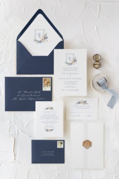 Nature and Environment — in particular greenery and water tones — will be very popular and a wonderful consideration for the colors and tones of your stationary. Navy is taking center stage as a solid neutral tone, and we’re seeing a lot of play on the blue spectrum of colors: dusty blue is going strong, navy tones, but we’re seeing also dips into Dutch blue, a lot of sky blue, hydrangea blue, and midnight blue. This suite by is a great start for a simple, elegant presentation with no-fuss navy that would work for any wedding in Ireland.
We will also see a lot of Gold take center stage on the wedding scene. A range of gold spectrum, from coppery tones to vintage brass to highly polished gold. We’re seeing gold letterpress, gold foil, gold font, gold leaf on the sides of of the stationary, gold accents like wax seals, ribbon, even brush stroke still.
What’s Out?
My personal design philosophy is nothing is ever “out” or “in” — it’s about retaining the integrity of your own personal style and vibe and having it in balance with your wedding day’s details. That said, for those who are interested, there are some trends that we’re seeing are losing popularity.
geometric shapes: anything cubism, 3D sketch, an emphasis on shape structure as the main focal design
overly moody: moody is always a look and in, but we’re seeing a decided use of pops of neutrals or bright colors also mixed in with darker moodier tones for sure
geode: that marble, geode style is out (yes, even with a gold accent sorry!)
Again, especially with covid — and I cannot stress this enough — the next two years have a lot of flexibility in terms of what’s “in” and not. It’s a chance for a do-over, it’s a “we finally get to have our wedding” type vibe. If you love a particular style and it’s you both, then do it. These trends are meant to give you some creative inspiration, get the conversation going and start the process, never to dictate.
Need some help deciding? Our design team is always ready to jump in with our keen eyes and point you in the right direction! Never hesitate to reach out and ask how we can help!


comments +